On a Tuesday in March we laid four scans of the same Little Bo-Peep plate across the studio table: a British Library JPEG at 1,200 pixels wide, an Internet Archive TIFF pulled from a Kate Greenaway facsimile, a Wikimedia Commons upload flagged "high resolution," and a print-on-demand vendor's rescan sold for fourteen dollars. Every nursery-decor forum will tell you the same thing about Victorian children's illustration on a wall: the older the source, the more honest the print, so buy the highest-resolution archive file you can find, size it up, frame it above the cot. For a long time we agreed with that advice completely.
Why the Highest-Resolution Archive Scan Really Is the Right Instinct
The advice is not lazy. It comes from a genuine problem worth solving. Most Victorian illustration in circulation on Etsy, Amazon and generic wall-art platforms is second-generation at best: a scan of a print of a scan, each pass losing edge integrity, each JPEG re-save eating another layer of tonal information off the cheek of the shepherdess and the wool of the lamb. The line quality that made these plates worth reproducing in the first place — the confidence of a wood-engraved contour, the small tremor in a hand-inked leaf — is the exact thing that dies first when the source file is thin.
So the counsel to hunt down the highest-resolution archival file has real merit. A 6,000-pixel Internet Archive TIFF of a first-edition plate genuinely does hold more of the original object than a 900-pixel Pinterest re-upload. If you print the good file at A3 or 30×40 cm, you can hold your face six inches from the frame and see the plate's actual ink texture. The paper grain of the 1899 impression is preserved. The engraver's crosshatching resolves into the individual strokes it always was. Nothing has been guessed at.
There is also the ethical piece. Nineteenth-century children's illustration entered the public domain long ago, and libraries have spent decades and considerable money digitising these plates at conservation-grade resolutions so that anyone can use them. Choosing the library scan over a vendor's tenth-generation rescan is choosing the source of record. It is the same instinct that pushes us to use NASA's own planetary fact sheet for our solar system chart rather than trusting a secondhand infographic. Start at the source. Everyone agrees on this rule for a reason.
But almost nobody hangs a nursery print six inches from their face, and Bo-Peep is going above a cot, not on a museum wall.
Where the Four Bo-Peep Scans Break Down Above the Cot
Here is what the fourteen-dollar test surfaced when we stopped looking at the scans on a screen and started printing them at real nursery sizes. At 40×50 cm, viewed from a typical nursing-chair distance of roughly two metres, the British Library scan and the Internet Archive TIFF look almost identical to the vendor's rescan. All three carry the same underlying weakness, and it has nothing to do with pixel count. It has to do with what a Victorian half-tone plate was originally designed to be seen from.
Chromolithographs and wood-engraved plates from the 1880s and 1890s were printed at book scale — roughly the size of a hardback children's storybook a child would hold in their lap. The line weight, the density of the crosshatching, the ink coverage in the shaded areas — all of it was calibrated for a reading distance of about thirty centimetres. When you scale that same image up to a 40×50 cm print and hang it two metres away, three specific things collapse. The fine crosshatching in the shepherdess's dress compresses into a muddy grey field that reads as dirt from across a room. The delicate outline around the lamb's ear, which was originally maybe half a millimetre thick on the printed page, becomes a nervous, over-thin filament that a small child's eye cannot fix on. And the paper foxing — the age-spotting that gives the scan its "authentic" character on a laptop screen — reads at nursery scale as a faint pattern of mildew across a child's wall.
The vendor's fourteen-dollar rescan actually performed slightly better than the two library scans on this last point, because whoever made it had already run an aggressive levels adjustment that flattened out the foxing. It also, unavoidably, flattened out a lot of the plate's tonal life along with it. What we were choosing between, in other words, was faithful-to-the-source-but-illegible-from-across-a-room versus adjusted-for-print-but-drained-of-what-made-it-worth-adjusting. Resolution was never the variable that mattered. The plate itself was doing something at book scale that does not translate to wall scale, no matter how many pixels are behind it.
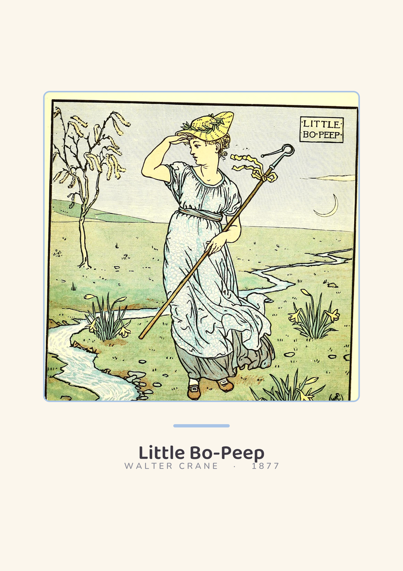 Little Bo-Peep
The print from this article · from €29.95
View the print →
Little Bo-Peep
The print from this article · from €29.95
View the print →
The Rule We Use Instead When a Chart Has to Read from Six Feet Away
The rule we work to in the studio is unglamorous: the drawing has to be conceived for the distance it will be seen from. If a nursery print will hang above a cot and be looked at from two metres by an adult and one metre by a standing toddler, then the line weight, the contrast, the density of detail and the size of the primary shapes all have to be designed for that reading distance from the first pencil sketch. You cannot bolt those qualities onto a plate that was drawn for a lap.
Practically, this means our own charts start from a two-metre sightline test and work backwards. The dinosaurs on *Dinosaurs to Scale* are drawn so the smallest of them is still legible from across a nine-square-metre nursery — a decision that dictated the line weight of every contour and the amount of internal detail we could give a Compsognathus. The letter forms on *El Abecedario* and *O Alfabeto* are set at a stroke width that holds at three metres, which is why the accompanying friendly words sit at a specific size ratio to the letters and not the arbitrary one an alphabet book would use. The dots on *One to Ten* have a minimum diameter chosen from the same sightline, which is why the "10" does not become a cluster of specks the way it does on most counting posters.
For Bo-Peep specifically, this is why we ended up commissioning a redraw rather than adapting any of the four scans. The redraw kept the original composition, the shepherdess's posture, the placement of the lamb — the things that make it Bo-Peep — and rebuilt the line weight and the tonal blocks for a two-metre wall. The paper foxing did not come with. Neither did the crosshatching. What arrived on the wall was the illustration a Kate Greenaway working for nursery walls, rather than storybooks, might have drawn. This is the same argument you can see in every chart we sell at see the Little Bo-Peep print — drawn once, at real wall scale, from the source data or the source composition, never scaled up from a lap-sized original.
When an Archive Scan of Little Bo-Peep Still Beats a Redraw
We should be honest about where the archive-scan rule still wins. If you are making a small print — anything up to about A5 — and it will hang somewhere a child or an adult can walk right up to and read at storybook distance, the highest-resolution archival scan is the correct choice, and a redraw is overkill. A small Bo-Peep on the wall beside a low reading nook, at the height where a four-year-old's face will be twenty centimetres from it, wants the original crosshatching intact and the tonal life the plate was drawn for.
The other case is a room where the whole design intention is a Victorian children's-library atmosphere: several small plates, hung as a cluster, read at close range, framed together as objects. There the plate wants to be a plate. Our redraw argument does not apply, because the reading distance the illustration was originally designed for is the reading distance it will actually get.
FAQ
Which of the four scans looked best on a computer monitor?
On-screen at 100%, the Internet Archive TIFF held the most tonal information and the cleanest edge detail, followed by the British Library JPEG. The Wikimedia Commons upload was noticeably weaker on edges, most likely from a JPEG re-save chain somewhere in its history. The vendor's fourteen-dollar rescan had the most aggressive contrast adjustment, which flattered it on a laptop and hurt it on a print. Monitor performance turned out to predict wall performance very poorly.
Does higher DPI at print time fix the reading-distance problem?
No, and this is the mistake we made for the first two years of the studio. DPI governs how sharply pixels resolve on paper; it does nothing about the fact that the underlying drawing was composed for a thirty-centimetre reading distance. A 600 DPI print of a book-scale plate at 40×50 cm still has crosshatching too fine to read from across a room and outlines too thin for a small child to fixate on. You have to fix the drawing, not the output setting.
Is a public-domain scan legally safe to print and sell?
Nineteenth-century illustration by an artist who died more than seventy years ago is generally in the public domain in most jurisdictions, and libraries typically release their scans under permissive terms or public-domain marks. That said, individual archives have their own terms of use, some of which restrict commercial reuse of the scan itself (as distinct from the underlying image). Read the specific archive's rights statement before you sell prints made from its file.
Why did the vendor's fourteen-dollar rescan sometimes look better than the library files?
Because the vendor had already applied the corrections we ended up wanting: a levels adjustment to flatten foxing, a contrast bump, and probably a slight sharpening pass. Those adjustments are the right instinct for wall printing and the wrong instinct for archival fidelity. The vendor got the design brief right by accident, at the cost of the source's tonal information. A studio redraw gets both.
Should a Bo-Peep print go above a cot at all?
That is a room-design question rather than a scan question, so a short answer: any wall art directly above a sleeping surface should be firmly hung, use shatter-resistant framing, and sit at a height where a standing adult sees it clearly without a child being able to reach it. The illustration choice itself is taste. If you like Bo-Peep in the nursery, hang Bo-Peep in the nursery.
What size does a nursery-wall Bo-Peep want to be?
For a print above a cot or dresser, seen from roughly two metres, we design to somewhere between 40×50 cm and 50×70 cm depending on the surrounding furniture and the width of the wall. Smaller than 30×40 cm and the illustration reads as decoration rather than as a picture; larger than 60×80 cm and the composition of a Victorian nursery plate starts to feel stretched past what it was drawn to hold, even in a redraw.
Would you ever recommend using an AI upscaler on the archive scan?
We tried this on all four Bo-Peep files as part of the same test. The upscalers invent detail plausibly, but they invent it — they do not recover it. On a Victorian plate the invented detail is particularly obvious: the crosshatching becomes suspiciously regular, the lamb's wool acquires a fur-like texture no engraver would have cut, and small anatomical features on the shepherdess's face drift slightly from the original. For a nursery wall we would rather redraw honestly than upscale dishonestly.
From the collection



New nursery prints and 10% off your first order.
One email now with your code. No noise after.