There is a pattern we keep seeing in the inboxes of a studio that draws nursery charts for a living: parents arrive with a folder of free printable vintage art prints, usually downloaded from Pinterest-adjacent blogs, and ask why the files look soft on the wall above the cot. The pattern is consistent enough to write about. The files are almost always 72 DPI, often cropped from screen captures, and almost never sized for the room they were asked to decorate. The problem is not that the prints are free. The problem is that free, in this corner of the internet, has quietly come to mean three different things at once.
The Pattern Of The 72-DPI Download
The first thing changed in 2026 is that the download button got easier and the file behind it got worse. The folder a parent sends us usually contains JPGs between 900 and 1600 pixels on the long edge. On a phone screen that reads as a sharp image. Printed at twenty-four by thirty-six inches above a changing table, which is a size parents reach for because they want the chart to carry the wall, the same file resolves at roughly forty to sixty dots per inch. Fine type disintegrates first. Hairline rules in old botanical plates go next. By the time it reaches the frame, the print looks like it was photographed through a window.
We draw everything in vector because of this exact failure mode. A vector chart like the alphabet in Español we call El Abecedario, or the Português alphabet called O Alfabeto, has no native size. The outlines are mathematics; the printer rasterises them at whatever density the paper deserves. A raster vintage printable, by contrast, has a ceiling built in on the day it was scanned, and most of the "free" vintage files circulating in 2026 were scanned a decade ago for blog thumbnails, not for walls.
There is a second quiet issue in the same files. Vintage botanicals, maps and alphabet plates were originally printed with cream or ivory paper tones that read warm under incandescent light. Modern phone screens display those tones under daylight-white backlight, which flatters them. When the same file prints on a bright white matte paper under a nursery's LED ceiling fixture, the composition that looked soft and golden on the download page suddenly looks grey. The file has not changed. The viewing environment did, and nothing in the free-printable workflow warned the parent about it.
What a parent should actually inspect before trusting a free vintage print is the native pixel dimension against the intended print size. The arithmetic is unforgiving. For a print that reads properly from the three-foot distance a toddler stands at, we want at least 240 pixels per inch at the final size. A twenty-four by thirty-six print therefore needs a file around 5,760 by 8,640 pixels. Almost nothing offered as a free vintage printable in 2026 clears that bar.
The Public Domain Confusion
The second thing that changed is that "public domain" and "free to download" began being used interchangeably by a generation of design blogs, and they are not the same thing. A great deal of pre-1930 botanical, zoological and astronomical illustration genuinely is public domain in most jurisdictions, which is why it keeps appearing in free print round-ups. But the actual digitised scan — the specific file hosted by a museum, library or hobbyist — may be governed by a separate licence applied to the scan itself, not the underlying artwork. Some institutions release scans under CC0, which is unambiguously free. Others release them under non-commercial licences, which still allow private nursery use but prohibit resale. A smaller tier releases nothing at all and simply tolerates personal downloads.
The practical consequence for a parent is small. Hanging a scan of an 1894 bird plate above a cot is not the kind of use anyone pursues. The practical consequence for the small Etsy sellers who repackage these scans into "vintage printable bundles" is larger, and parents end up buying the same public-domain scan from three different sellers at three different prices, in three different file qualities, because none of the listings disclose where the scan originated.
Free, when it comes to vintage prints, has quietly become a word that describes the download button rather than the file, the rights or the paper it will end up on.
This is where a studio with its own drawn work has an unusual vantage point. We can state exactly what each chart's source is because we are the source. The dinosaurs chart we call Dinosaurs to Scale is an original vector drawing of seven species next to a human figure, using commonly cited palaeontology length estimates. The counting chart One to Ten is drawn from scratch in nursery pastels, each numeral paired with the right number of dots. The solar system work we do is grounded in the NASA Planetary Fact Sheet, and the world geography pieces are drawn from Natural Earth. Those sentences are short because the chain of provenance is short.
A free vintage print rarely has a chain that short. The file travelled from a library scan, through a design blog, through a reposting on Pinterest, through a round-up blog, to the download link. Each handoff silently discarded the licence metadata, so by the time the file reaches the parent, the paperwork is gone even when the use is lawful. That erasure is not malicious. It is the natural entropy of the free-printable supply chain, and it is the reason a conscientious parent sometimes ends up pulling a print off the wall after reading something uncomfortable in a comments thread two years later.
The Nursery Mismatch Nobody Flags
The third thing that changed is less visible than the first two and is the one we care about most. Vintage printable catalogues were curated for adult walls — hallways, studies, powder rooms — and have been quietly repurposed as nursery wall art without anyone checking whether the compositions actually belong on a nursery wall. Three mismatches recur.
The first is reading distance. Vintage botanical and natural-history plates were drawn for a reader seated at a desk, holding the book twelve to eighteen inches from the eye. The lettering on those plates — species names, Latin binomials, scale bars — was sized for that distance. On a nursery wall, the reader is a small child standing three feet away and an adult standing six, and nothing on a 1900 engraved plate was composed for either sightline. The illustration survives the scaling up. The typography does not. It becomes decorative noise.
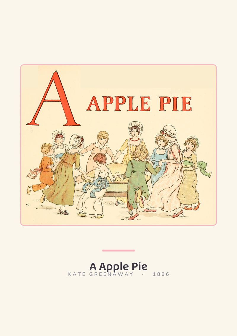
The second mismatch is contrast. Children at the age the chart is meant to serve — roughly eighteen months to five years — read shape and silhouette long before they read line. A nursery alphabet that works is high-contrast and uncluttered: each letter is a confident shape, each paired word is drawn as a recognisable object. That is the specific brief O Alfabeto and El Abecedario were drawn to. A vintage alphabet plate from a Victorian primer, however beautiful, is almost always the opposite — low-contrast, dense with ornament, and designed for a reader who has already learned to decode letters and is now admiring the engraver's hand. The chart teaches a child who already reads. The nursery version teaches a child who does not yet.
The third mismatch is subject. A vintage zoological plate of extinct species, prized by adult collectors for its scientific rigour, can be a cramped and unreadable composition for a toddler who wants to see one dinosaur, large, next to a person for scale. Dinosaurs to Scale is drawn exactly to that reading: seven species, one human silhouette, no clutter. The visual argument is immediate because the composition was built for a child's eye line. A reproduction of an 1870 palaeontology engraving, framed above the cot, is a lovely object. It is not the same object. It is doing a different job.
None of this is a criticism of vintage work. The studio has old natural-history books on the shelf and loves them. The point is that the catalogue of "vintage printable art" being handed to parents online was not curated with a nursery brief. It was curated for people who wanted their study to look like an apothecary. When those files land on a cot wall, the composition is often working against the child.
So What Do You Actually Do
If the folder of free vintage printables is already downloaded, run three checks before paying anyone to frame or print them. Open the file at its native size and divide the pixel dimensions by the inches you intend to print at. If the result is under about 240, the file will look soft at that size; print smaller, or do not print at all. Look at the file next to the wall under the actual lighting of the room, not on a phone in daylight. The warm cream tones that read beautifully on a screen can collapse to a dull grey under cool LED, and that is the environment the print will live in. Then ask what the chart is for. If it is decor for an adult eye enjoying a child's room, a soft vintage reproduction can earn its space. If it is a chart a child is meant to read — alphabet, numbers, animals, geography — the brief changes and vintage reproductions almost always lose to work drawn for the brief.
If the folder is not yet downloaded, consider the hidden cost. Free, in this market, usually means an hour spent sorting file quality, a trip to a print shop that will quietly refuse to print anything below 150 DPI at the requested size, a cheap frame to match the modest spend, and a result that looks like it cost what it cost. Our own charts in the shop at /shop/ are not pretending to be free. They are drawn as vectors so the file prints cleanly at any size, sourced to the data they claim to teach, and composed for the specific reader standing three feet from the wall. That is a different proposition from a Pinterest download, and it should be priced like one.
There are three things this piece did not cover and should name honestly. It did not address framing choices — matting, glass versus acrylic, the specific hanging height above a changing table — because that is a separate argument about rooms rather than files, and we have written it elsewhere. It did not address the question of when a nursery chart has outlived its usefulness and should move to a hallway or a drawer, which is a question about the child rather than the print. And it did not cover digital-first alternatives — projected charts, e-ink nursery displays, screen-based learning aids — because the studio's work is paper, and we are not qualified to compare paper against glass. Each of those is a separate article, and each deserves to be written without being folded into a piece that was really about one thing: the quiet gap between the word "free" and the wall it ends up on.
From the collection
New nursery prints and 10% off your first order.
One email now with your code. No noise after.